组件功能
数据可视化组件,用于以图形方式展示结构化数据,支持柱状图、折线图和面积图等常见图表类型,适用于趋势分析、对比展示和统计汇总等场景。
基础用法
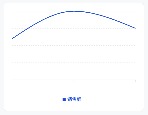
通过 type 指定图表类型,data 提供数据源,series 定义数据系列的展示方式,xAxis 用于配置横轴字段或显示规则。
Template 示例:
<Card>
  <Chart
    xAxis="month"
    data={[
      { month: '1月', sales: 120 },
      { month: '2月', sales: 200 },
      { month: '3月', sales: 150 },
    ]}
    series={[
      { type: 'bar', dataKey: 'sales', label: '销售额', color: '#0052D9' },
    ]}
  />
</Card>
效果展示如下:
属性说明
| 属性名 | 类型 | 描述 | 默认值 |
|---|---|---|---|
| data ★ | ChartDataRow[] |
图表数据数组 | - |
| series ★ | SeriesConfig[] |
系列配置数组 | - |
| xAxis ★ | string | XAxisConfig |
X 轴配置或数据字段名 | - |
| width | number | string |
图表宽度 | - |
| size | number | string |
图表尺寸 | - |
| minWidth | number | string |
最小宽度 | - |
| maxWidth | number | string |
最大宽度 | - |
| showTooltip | boolean |
显示提示框 | true |
| showYAxis | boolean |
显示 Y 轴 | false |
| showLegend | boolean |
显示图例 | true |
| barGap | number | string |
柱状图间距 | - |
| barCategoryGap | number | string |
柱状图分类间距 | - |
| flex | number | string |
Flex 值 | - |
| aspectRatio | number | string |
宽高比 (如 16/9) | 4/3 |
注意:
★ 标记为必填属性。
尺寸说明
-
在容器内(有
data-w-container属性的父元素):图表宽度默认为100%,自适应容器。 -
不在容器内且未设置
width/size:图表宽度默认为260px。 -
高度控制:默认由
aspectRatio决定(4:3)。
ChartDataRow 类型
数据对象支持任意字段:
{
  [key: string]: any; // 如 date, Desktop, Mobile 等
}
SeriesConfig 类型
每个系列配置通过 type 属性指定图表类型。如果所有系列类型相同,使用对应的图表容器;如果类型不同,则使用混合图表模式。
柱状图系列:
{
  type: "bar";
  dataKey: string;     // 数据字段名
  label?: string;      // 系列标签
  color?: string;      // 柱子颜色
  stack?: string;      // 堆叠分组ID
}
折线图系列:
{
  type: "line";
  dataKey: string;
  label?: string;
  color?: string;
  curveType?: CurveType; // 曲线类型
}
面积图系列:
{
  type: "area";
  dataKey: string;
  label?: string;
  color?: string;
  curveType?: CurveType;
  stack?: string;
}
XAxisConfig 对象
用于对 X 轴进行精细化控制。
| 属性名 | 类型 | 描述 | 默认值 |
|---|---|---|---|
| dataKey ★ | string |
数据字段名 | - |
| label | string | number | object |
坐标轴标签 | - |
| type | "number" | "category" |
坐标轴类型 | "category" |
| hide | boolean |
是否隐藏 | false |
| angle | number |
Tick 旋转角度 | - |
| tickMargin | number |
Tick 间距 | - |
| allowDuplicatedCategory | boolean |
允许重复分类 | false |
CurveType 类型
折线图和面积图支持以下曲线类型:
-
"basis"- 基础曲线 -
"linear"- 直线 -
"natural"- 自然曲线 -
"monotoneX"- X 轴单调曲线 -
"monotoneY"- Y 轴单调曲线 -
"step"- 阶梯曲线 -
"stepBefore"- 前阶梯 -
"stepAfter"- 后阶梯
使用示例
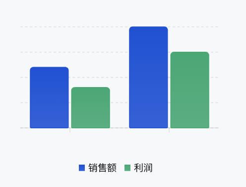
柱状图
Template 示例:
<Chart
  xAxis="month"
  data={[
    { month: "1月", sales: 120, profit: 80 },
    { month: "2月", sales: 200, profit: 150 }
  ]}
  series={[
    { type: "bar", dataKey: "sales", label: "销售额", color: "#0052D9" },
    { type: "bar", dataKey: "profit", label: "利润", color: "#00A870" }
  ]}
/>
效果展示如下:
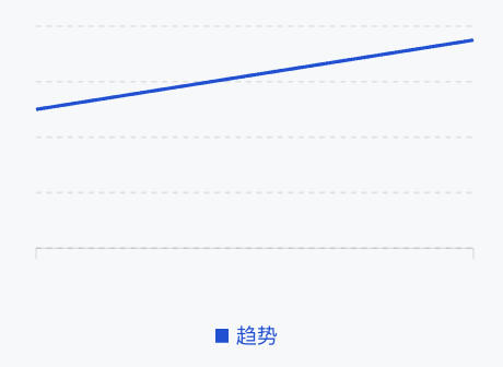
折线图
Template 示例:
<Chart
  xAxis="date"
  data={[
    { date: '2024-01', value: 100 },
    { date: '2024-02', value: 150 },
  ]}
  series={[
    {
      type: 'line',
      dataKey: 'value',
      label: '趋势',
      color: '#0052D9',
    },
  ]}
/>
效果展示如下:
面积图
Template 示例:
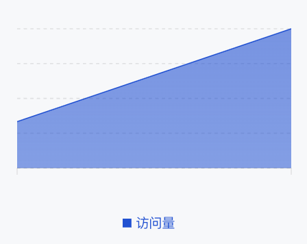
<Chart
  xAxis="time"
  data={[
    { time: "00:00", visitors: 100 },
    { time: "12:00", visitors: 300 }
  ]}
  series={[
    {
      type: "area",
      dataKey: "visitors",
      label: "访问量",
      color: "#0052D9"
    }
  ]}
/>
效果展示如下:
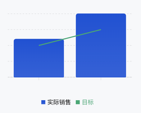
混合图表
可以在同一个图表中混合使用不同类型的图表进行展示。
Template 示例:
<Chart
  xAxis="month"
  data={[
    { month: "1月", sales: 120, target: 100 },
    { month: "2月", sales: 200, target: 150 }
  ]}
  series={[
    { type: "bar", dataKey: "sales", label: "实际销售", color: "#0052D9" },
    { type: "line", dataKey: "target", label: "目标", color: "#00A870" }
  ]}
/>
效果展示如下: