组件功能
Form 是表单容器组件,用于包裹表单控件并处理提交事件。
它继承了 Box 组件的布局能力,同时支持定义表单提交动作。
基础用法
通过 direction 控制子组件的排列方向,通过 children 定义表单内的控件,gap 用于设置子元素之间的间距。
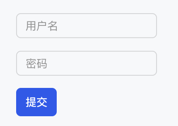
下面示例展示了一个用户登录表单,包括用户名和密码输入框,以及提交按钮。
Template 示例:
<Form
  direction="col"
  gap="16px"
  onSubmitAction={{ type: "submit_form", payload: { formId: "user-form" } }}
>
  <Input name="username" placeholder="用户名" />
  <Input name="password" inputType="password" placeholder="密码" />
  <Button label="提交" submit={true} />
</Form>
效果展示如下:
属性说明
表单属性
| 属性名 | 类型 | 描述 | 默认值 |
|---|---|---|---|
| onSubmitAction | ActionConfig |
表单提交时触发的动作 | - |
布局属性
| 属性名 | 类型 | 描述 | 默认值 |
|---|---|---|---|
| direction | "row" | "col" |
布局方向 | "col" |
| children | ChatKitComponent[] |
子组件列表 | - |
| align | Alignment |
交叉轴对齐方式 | - |
| justify | Justification |
主轴对齐方式 | - |
| wrap | "nowrap" | "wrap" | "wrap-reverse" |
换行方式 | "nowrap" |
| flex | number | string |
Flex 值 | - |
| gap | number | string |
子元素间距 | - |
| padding | number | string | Spacing |
内边距 | - |
| border | number | Border | Borders |
边框配置 | - |
| background | string | ThemeColor |
背景颜色 | - |
尺寸属性
| 属性名 | 类型 | 描述 | 默认值 |
|---|---|---|---|
| height | number | string |
高度 | - |
| width | number | string |
宽度 | - |
| size | number | string |
同时设置宽高 | - |
| minHeight | number | string |
最小高度 | - |
| minWidth | number | string |
最小宽度 | - |
| minSize | number | string |
最小尺寸 | - |
| maxHeight | number | string |
最大高度 | - |
| maxWidth | number | string |
最大宽度 | - |
| maxSize | number | string |
最大尺寸 | - |
| aspectRatio | number | string |
宽高比 | - |
| radius | RadiusValue |
圆角 | - |
| margin | number | string | Spacing |
外边距 | - |
Form 组件继承了 Box 组件的所有布局能力,详细类型定义请参见 Box 盒子。