组件功能
倒计时组件,用于显示剩余时间,支持自定义样式和完成回调。
基础用法
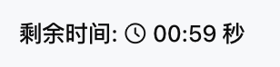
通过 duration 设置总时长,prefix 和 suffix 可定制显示文本。
Template 示例:
<Countdown duration={60} prefix="剩余时间: " suffix=" 秒" />
效果展示如下:
属性说明
| 属性名 | 类型 | 描述 | 默认值 |
|---|---|---|---|
| duration ★ | number |
倒计时总时长 (秒) | - |
| prefix | string |
倒计时前缀文本 | - |
| suffix | string |
倒计时后缀文本 | - |
| size | "xs" | "sm" | "md" | "lg" | "xl" |
组件尺寸 (与 Text 对齐) | "md" |
| color | string | ThemeColor |
文本颜色 | - |
| onComplete | ActionConfig |
倒计时结束时触发的动作 | - |
注意:
★ 标记为必填属性。
颜色配置
color 属性支持以下类型:
-
Text color tokens,例如
"text-primary","text-secondary"。 -
Primitive color tokens,例如
"blue-500","red-600"。 -
CSS 颜色字符串,例如
"#FF0000","rgb(255, 0, 0)"。 -
Theme-aware 对象,
{ "light": "#000000", "dark": "#FFFFFF" }。
使用示例
Template 示例:
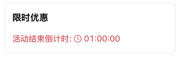
<Card>
  <Title value="限时优惠" />
  <Countdown
    duration={3600}
    prefix="活动结束倒计时: "
    size="lg"
    color={{ light: "#E34D59", dark: "#F66F6A" }}
    onComplete={{
      type: "show_message",
      payload: { message: "活动已结束" }
    }}
  />
</Card>
效果展示如下:
显示格式
倒计时会根据剩余时间自动调整显示内容:
-
少于 1 分钟:仅显示秒数,例如 59 秒。
-
少于 1 小时:显示分钟和秒数,例如 12 分 30 秒。
-
1 小时以上:显示小时、分钟和秒数,例如 1 时 15 分 20 秒。